First Nations Foundation is very excited to share that we have recently undergone a review and update of the FNF brand, including our main logos and those of our various financial literacy training and outreach programs.
The Foundation has worked with Indigenous design agency Relative Creative and Aboriginal artist Rachael Sarra to develop a brand image that’s contemporary and culturally respectful to the Indigenous Australian communities we work with.

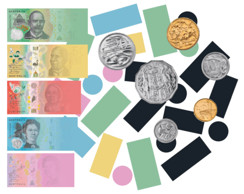
As an Australian First Nations centred foundation, the new FNF branding references the current Australian currency. This has been done through the use of colour and the shapes of Australian currency. The form of rectangles and circles is also locked up in a larger circle, to represent the relational views of many First Nations peoples to their finances. Finally, the deep dark navy represents ‘Black’ / First Nations peoples having an active autonomy over their finances. Contrastingly, the colour forms can also metaphorically represent that ‘out of the darkness and vagueness of financial freedom, comes the colourful light.

Sub-brands of First Nations Foundation
Within the FNF brand umbrella sits two subbrands that speak to the FNF core branding. The relationship between these brands are well established through the use of the same fonts, colours and graphic treatment. It’s important to note that although similar aesthetically the application between brands differ dramatically.
First Nations Foundation artwork

Rachael Sarra is an artist and designer whose work is an extension of her being and experiences. As a contemporary Aboriginal artist from Goreng Goreng Country, Rachael uses art as a powerful tool in storytelling to educate and share Aboriginal culture
and it’s evolution. Rachel was commissioned to create this piece for First Nations Foundation.
“This artwork is aligning to the idea that knowledge is power. In this sense money knowledge is empowerment and empowerment is also decolonising and resisting the control we have had placed
on us. I’ve consciously used the colour to establish a conscious shift. An idea of coming from darkness. While the white elements use visual metaphors of coins through a contemporary cultural context in a way that it feels like it’s bubbling and overflowing so that the users feel culturally safe and empowered and can see that light that they may not have been exposed to from the generations that have come before us” –Rachael Sarra
To access the full suite of our new logos please contact us on operations@fnf.org.au.


